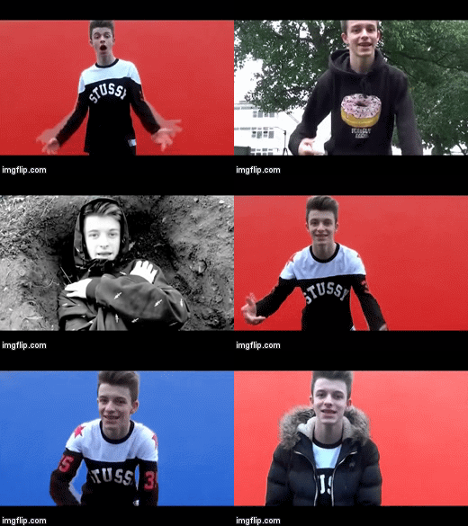
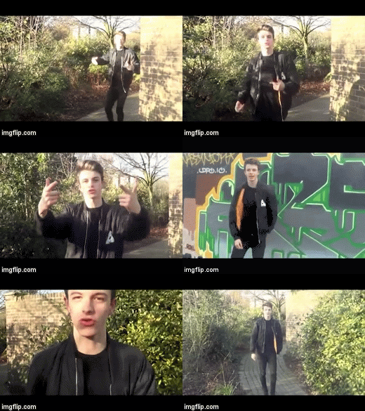
Throughout this process, we wanted to promote the uniqueness of our newest artist and share his new found talent amongst other who'll listen. I feel that this was displayed effectively through our digipak, website and music video using consistency as their is a continual theme and colour scheme throughout. We created the digipak and website with the music video in mind so that we could make them link and as a whole promote our new artist. This way, all our texts are linked effectively. Each product is also designed to promote the different products in the range whilst maintaining synergy.
Within the music video, there are links between our general theme and concept that we tried to portray through the music video and ancillary texts. Our primary target audience is 15-22 year olds but more specifically, those who are interested in rap music. Our target audience is relative to our social media audience feedback found on our iSO page.
At the beginning of the music video there are several shots of the sun moving across the sky as time lapses. This relates to the galaxy theme applied throughout our website and digipak.
The continual scheme of dark colours and darker backgrounds used for the digipak, website and album cover are contrasted as these brighter colours feature in the middle of the music video. However the colours also appear on the album cover and the digipak in the ora around iSO.


